What it is
“Achieving True Interoperability in Healthcare Systems” is a five-minute introductory video from InterSystems Learning Services. It introduces semantic interoperability, the idea that health data should be not only transmitted reliably between systems but also understood, and shows how the HL7 FHIR standard can help. This YouTube video covering what interoperability is and how it can be achieved within healthcare is the first artefact I have chosen. It appeals to me as I study Health Information Science and interoperability is one of the key concepts we need to learn, so as a beginner I would find this video helpful.
Youtube Link: Achieving True Interoperability in Healthcare Systems (InterSystems Learning Services)
How it teaches interoperability
Interoperability is a threshold concept because, once learners grasp it, they stop seeing health systems as separate tools and start seeing them as parts of one connected whole. The video teaches it through simple slide-style animations, a spoken explanation, and brief on-screen text. It presents interoperability as data moving between systems, then introduces FHIR as a standard that supports that exchange.
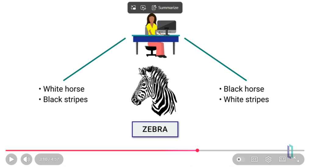
At 3:10, the video explains semantic interoperability with a zebra. One system describes the animal as a white horse with black stripes, and the other as a black horse with white stripes. Both describe the same animal in different words, which shows that exchanging data is not enough unless both systems share its meaning. Using an animal everyone recognizes, instead of a complex clinical example, links the idea to prior knowledge and keeps beginners focused on the concept.
Critique using Mayer’s principles
Coherence. Each slide contains only a small amount of text, and the images are clear and relevant, with no decorative extras. This follows Mayer’s coherence principle: leaving out unnecessary material means the learner’s limited working memory goes to the concept instead of to sorting out clutter. It also reduces extraneous cognitive load.
Modality and redundancy. The video pairs animated graphics with spoken narration and only a little written text. Mayer’s modality principle holds that graphics with narration work better than graphics with on-screen words alone, and the redundancy principle warns against repeating the narration as full text on screen. Because the slides carry few words, the brief text supports the narration without duplicating it, so viewers aren’t forced to read and listen to the same content at once.
Contiguity. The images matched what the speaker was saying as they were explaining it. This follows the temporal contiguity principle, which says words and pictures presented at the same time are learned better than those presented one after the other.
Limitations. The video is aimed at a broad professional audience, so a learner with no health-informatics background may need terms like HL7 and FHIR defined up front, which is the pre-training principle. It is also a passive format. It doesn’t ask viewers to pause and explain a step, so any self-explanation is left up to the learner.
My Experience
As a Health Information Science student, I know the degree aims to improve patient outcomes through seamless interoperability, by collecting and analyzing patient data to support informed decisions. I found this video easy to follow. The slides were not overloaded with text, and the clear images matched the speaker’s explanations, so I never had to choose between reading and listening. I wish I had watched it in my first class, because it would have made the process much easier to understand from the start.
Verdict
An excellent first-class resource: short, clear, and uncluttered. I would add a worked example and a pause-and-explain prompt to turn passive watching into active learning.