Presentation: Canada Health Infoway – Interoperability
What it is
Artefact 5 is a slide presentation from Canada Health Infoway dated May 7, 2024, presented by Samantha Zaffino, Senior Manager of Strategy and Program Management. The slides are numbered 45 to 59, so this appears to be an excerpt of a longer presentation. It covers why Canada needs interoperability, the roadmap’s goals, progress so far, and how stakeholders can take part.
How it teaches interoperability
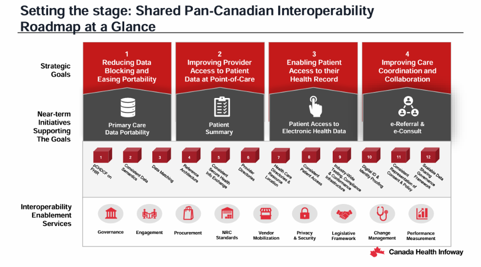
The deck teaches interoperability as a coordinated national effort, not just a technology fix. It starts with the need, then presents the roadmap’s four strategic goals, near-term initiatives, and enabling services such as governance, privacy and security, and procurement. Later slides show progress through a table of specifications, vendor participation, and market guidance. This extends Review 4: the deck is about organizational interoperability, meaning shared policies, governance, and processes. It also connects to semantic interoperability, since the data content framework is described as necessary for it.
Critique using Mayer’s principles
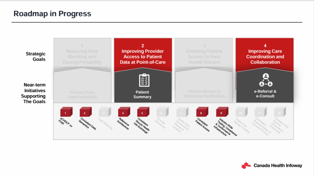
Signaling. Consistent titles, numbered items, and red highlighting of key phrases guide attention. The best example is the “Roadmap in Progress” slide, which greys out inactive goals and keeps active ones in red, so status is visible at a glance, although the greyed text is hard to read. Numbered cubes in the roadmap graphic reappear in the progress table, linking the two slides.
Source: Canada Health Infoway, May 2024
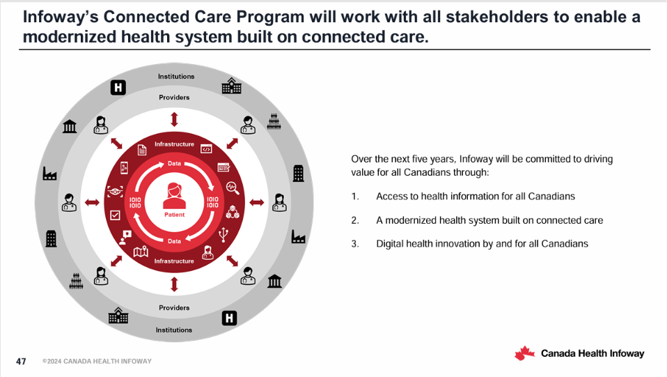
Multimedia and spatial contiguity. The concentric circle diagram places the patient at the centre, surrounded by data, infrastructure, providers, and institutions, showing relationships that text alone could not. The “Immediate Priorities” slide puts each icon above its description. However, the labels under the cubes on the “Roadmap at a Glance” slide are small and rotated diagonally, which makes them hard to read.
Source: Canada Health Infoway, May 2024
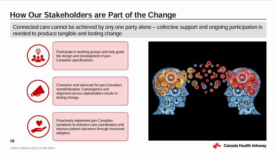
Coherence. Several elements do not support learning: a stock image of two gear-filled heads on a black background, a wall of vendor logos, and a scholarship announcement at the end. These add load without teaching.
Source: Canada Health Infoway, May 2024
Pre-training and redundancy. Acronyms such as pCHDCF, CA:eReC, NRC, and DFT, and terms like FHIR and EMR, appear without definitions, so a newcomer would struggle. Slides such as “Key Tenets” and “Initial Core Components” also place full paragraphs on screen. If a speaker read them aloud, this would break the redundancy principle, and without a speaker the text must carry the whole explanation. As a standalone PDF, it works better as a reference document than as a teaching tool. Delivered in person, a speaker’s narration could carry the explanation while the slides stay light, which fits the modality principle.
My experience
I like presentations when concise text is backed by visuals, which helps me absorb information. They work best in person, where a speaker can vocalize and explain the content more simply. Some of these slides were too wordy and would work better as short bullet points, and some diagrams were unclear: the grey text was barely visible and the text was small. I would not use a presentation as my main way of learning. I prefer the YouTube animation in Review 1 or interactive learning like Review 4.
Verdict
Valuable for professionals who need the big picture of Canada’s approach, and better delivered in person than read alone. For beginners, I would define acronyms, trim the text, and enlarge the small and greyed-out text.